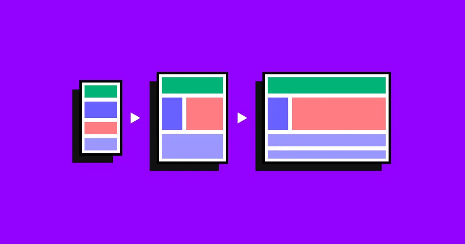


Introduction: In today's fast-paced digital world, it is essential for websites to be accessible and visually appealing across various devices and screen sizes. Responsive design is the key to achieving this goal, enabling websites to adapt and provide optimal user experiences. CSS (Cascading Style Sheets) plays a pivotal role in implementing responsive design techniques, empowering developers to create dynamic and flexible web interfaces. In this article, we will explore some best practices for responsive design with CSS.
Embrace Fluid Layouts and Percentage-Based Sizing: Responsive design necessitates a departure from fixed pixel-based layouts. Instead, developers should embrace fluid layouts that adapt seamlessly to different screen sizes. Using percentage-based sizing ensures that elements within a container adjust proportionally, maintaining a harmonious layout. By allowing elements to scale, the website's content can be optimally displayed on screens of various dimensions, from desktops to smartphones.
Say No to Fixed Values: Fixed values, such as pixel-based font sizes, can cause readability and accessibility issues on smaller screens. Instead, utilize relative units like em or rem, which adapt their size based on the font size of the parent element or the root element, respectively. This approach ensures that text and other elements remain legible, regardless of the device used.
Avoid Using Height: While setting a fixed height may seem tempting to achieve a specific design aesthetic, it often results in elements being cut off or overflowing on different screens. By allowing elements to grow naturally based on their content, the design becomes more fluid and adaptable. Utilize CSS properties like
min-heightandmax-heightto provide some control while maintaining responsiveness.Optimize Images for Responsiveness: Images are a crucial part of web content, and ensuring they adapt seamlessly is vital for a responsive design. Use CSS techniques such as
max-width: 100%to prevent images from exceeding their container's width and potentially breaking the layout. Additionally, leverage responsive image techniques like thesrcsetattribute and the<picture>element to serve appropriate image sizes based on the device's resolution.Leverage Media Queries for Breakpoints: Media queries enable developers to apply different CSS styles based on the characteristics of the user's device. By defining breakpoints at specific screen widths, developers can adapt the layout, typography, and other design elements accordingly. This allows for a seamless transition between different screen sizes, providing an optimized user experience on any device.
Use Flexbox and CSS Grid for Layouts: Flexbox and CSS Grid are powerful layout modules in CSS that enable developers to create dynamic and responsive page structures. Flexbox provides a one-dimensional layout system, ideal for arranging elements within a single row or column, while CSS Grid offers a two-dimensional grid-based layout system. These techniques provide flexibility and control over the placement of elements, ensuring responsiveness across devices.
Conclusion: Responsive design has become a fundamental aspect of modern web development. By following the best practices mentioned above and utilizing CSS features effectively, developers can create websites that adapt flawlessly to various devices and screen sizes. The ability to deliver an optimal user experience on any device is paramount in today's mobile-centric world. Embrace the power of responsive design with CSS, and unlock the potential for dynamic and visually stunning web experiences.